Boost eCommerce Sales with User-Friendly Site Navigation
Boost eCommerce Sales with User-Friendly Site Navigation
Getting Started
Introduction
Introduction
Effective website navigation is essential to the success of any eCommerce store. When customers can easily find the products they want or seamlessly explore new ones, they’re far more likely to make a purchase, boosting both sales and user satisfaction.
Despite its importance, a recent 2024 benchmark study found that 76% of eCommerce sites still fall short in navigation performance, leaving potential sales on the table.
In this guide, we’ll explore the most effective practices for creating intuitive, user-friendly navigation. You’ll find actionable tips and real-world examples to help you enhance your site’s navigation and make it easier for customers to discover and buy your products.
Why is User-Friendly eCommerce Navigation Essential?
Why is User-Friendly eCommerce Navigation Essential?
Imagine stepping into a store where nothing is labeled, aisles are winding and confusing, and there’s no assistance in sight. That’s how frustrating poor website navigation feels for online shoppers. In contrast, a store with clearly marked sections and an intuitive layout invites customers to explore freely, discover new items, and spend more time browsing. This is the impact of user-friendly eCommerce navigation—it shapes the customer experience and directly influences sales.
User-friendly navigation is critical because it:
Boosts Product Discovery: When navigation is poorly organized, customers struggle to find even basic items, like running socks. Clear category structures and intuitive menus guide shoppers to the products they need, reducing friction and increasing conversions.
Reduces Abandonment Rates: Frustrating site experiences lead to higher bounce rates. Features like highlighting a user’s current location within the site help customers feel oriented and engaged, rather than frustrated and ready to leave.
Encourages Browsing: Effective category pages and homepage elements, like carousels, allow users to explore new products, even if they’re not sure what they want. This browsing experience is ideal for customers looking to discover items or build their shopping cart as they go.
In short, user-friendly navigation doesn’t just improve usability; it boosts search engine optimization (SEO), drives more sales, and builds customer loyalty. A well-structured navigation is a cornerstone of a positive eCommerce experience, making it easier for customers to find, explore, and buy what they need.
Seven eCommerce Navigation Best Practices
Seven eCommerce Navigation Best Practices
1. Feature Key Information in Your Header
Your header is prime real estate—seen by nearly all of your site visitors and setting the tone for their experience. A well-designed header creates immediate trust and clarity, helping customers locate what they need without any guesswork. Simplicity, clear labels, and logical placement are key. The header typically includes main navigation links, a search bar, cart button, and potentially links to customer support, store locations, or promotions.
To make the most of this space, consider what matters most to your audience, based on their on-site behavior. For example:
Popular Requests: If customers frequently search for store locations, add a prominent link.
Promotions: Have a major sale or limited-time offer? Feature it in the header to grab attention.
Customer Support: If reaching your team is essential, add a link to live chat or support.
Prioritize content in the header based on data—use analytics to determine what resonates most with your audience, while keeping the design uncluttered and user-friendly.
2. Make the Search Bar a Key Navigation Tool
For many shoppers, a search bar is their primary tool for finding products, especially if they know exactly what they want. In these cases, a prominent, Amazon-style search bar—bold and centrally located—can be incredibly effective. Ideally, your search bar should offer autocomplete suggestions and highlight popular items, providing a more streamlined shopping experience for both desktop and mobile users.
You can test different search styles to see what works best for your store, such as text-only results versus image-based suggestions. Just ensure that clickable elements are clearly styled so users know where clicks will take them. To make your search bar even smarter, consider implementing advanced filtering options or smart search plugins.
3. Add a Site-Wide Benefits Bar
Your header serves as an introduction, but a site-wide benefits bar directly below it reinforces why customers should shop with you over a competitor. This space acts as a trust anchor, communicating unique selling points and additional perks.
Highlight customer-centric benefits here, such as:
Free Shipping: Display the threshold for free shipping to encourage larger orders.
Return Policies: Clearly state your return policy to reassure hesitant buyers.
Flexible Payments: Offer payment options like "Buy Now, Pay Later" to accommodate different budgets.
This benefits bar can be updated to reflect seasonal deals, time-sensitive offers, or any information that adds immediate value to customers and builds trust.
4. Structure Your Navigation Logically
A well-structured navigation system (or information architecture) makes it easier for customers to find and compare products, directly supporting their journey toward a purchase. Group products into clear parent categories (e.g., "Home Furniture") and subcategories (e.g., "Sofas" or "Coffee Tables"), ensuring the most relevant items are grouped together. For products that could fit under multiple categories, consider listing them in multiple sections to reduce friction and improve product findability.
For example, a coffee table might appear under both "Living Room" and "Tables" categories. This approach avoids missed sales by ensuring customers see relevant products no matter how they navigate the site.
5. Use Mega Menus for Large Catalogs
For stores with extensive product ranges, a mega menu is an effective way to present all categories and subcategories at a glance. These two-dimensional menus organize navigation options into clearly separated sections, enhancing usability and reducing the need for scrolling. Major retailers like Walmart, Best Buy, and Zappos utilize mega menus to simplify navigation across vast catalogs, allowing users to find what they need quickly.
Smaller catalogs can benefit from simpler dropdowns with clear links to primary categories. The aim is to give customers quick access to popular sections while keeping the design clean and easy to scan.
6. Create a “Sales” or “Deals” Section
A dedicated “Sales” or “Deals” section in the main navigation lets budget-conscious shoppers quickly find discounted products, enhancing user experience and potentially boosting sales. Consider implementing filters within this section to let users search by discount level, price range, or category.
For example, you could display categories like “Under $20” or “Clearance 50% Off.” Some retailers, like Fashion Nova, offer options such as “New to Sale” and “Biggest Discounts,” allowing users to target specific deals or explore new markdowns.
7. Guide Shoppers with Contextual Navigation
Contextual navigation creates a smoother, more intuitive shopping journey by suggesting related or complementary products based on what the customer is currently viewing. For example, if a shopper is browsing winter coats, contextual navigation might recommend boots or gloves, aligning with the customer’s needs and creating a more personalized experience.
Contextual navigation adapts to the user’s activity on the site, guiding them to relevant options without requiring extra steps. This approach not only improves user engagement but also increases the likelihood of discovering additional products that enhance their purchase.
Invest in Smart Navigation for Your Online Store
Effective eCommerce navigation is a balance of clarity, organization, and simplicity. From concise headers and organized categories to mega menus and smart contextual suggestions, thoughtful navigation design creates a seamless shopping experience that boosts conversions. Nail down these essentials, and you’ll find more customers confidently navigating your store, discovering products they love, and converting at checkout.
Real-World Examples of Effective eCommerce Navigation: Breaking Down Top Brands' Best Practices
Real-World Examples of Effective eCommerce Navigation: Breaking Down Top Brands' Best Practices
Effective eCommerce navigation is crucial for guiding users seamlessly through a website, enhancing their shopping experience, and boosting conversion rates. Let's explore real-world examples of brands that have mastered this aspect, breaking down their navigation structures and design choices.
1. Amazon: Comprehensive Mega Menus
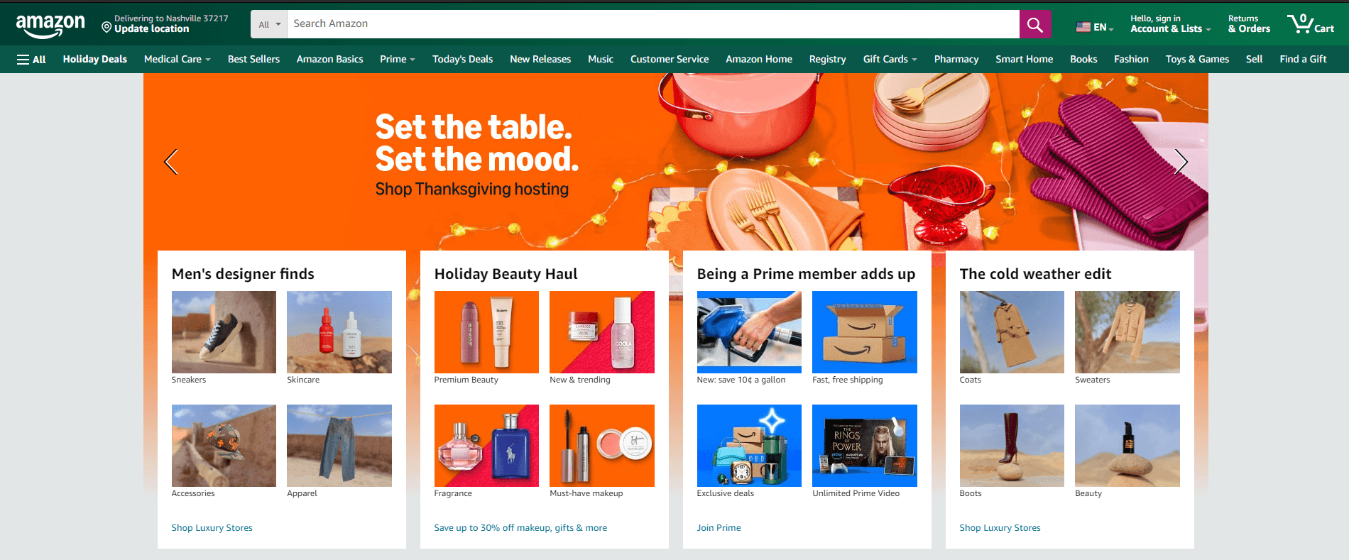
Amazon's navigation is a prime example of handling an extensive product range efficiently.
Mega Menu Structure: Hovering over the "All" button reveals a mega menu displaying broad categories like "Electronics," "Books," and "Clothing." Each category expands into subcategories, allowing users to drill down to specific products quickly.
Search Bar Prominence: A centrally placed, prominent search bar with autocomplete suggestions helps users find products directly, catering to those who prefer searching over browsing.
Personalized Recommendations: Based on browsing history, Amazon offers personalized links such as "Inspired by your shopping trends," enhancing user engagement.
2. IKEA: Intuitive Category Navigation
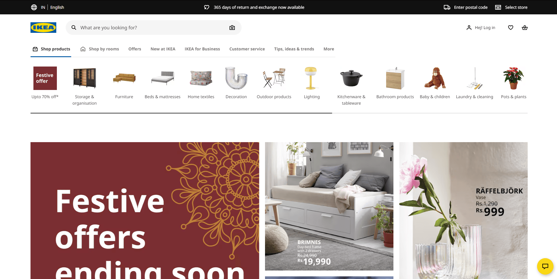
IKEA's website simplifies navigation through clear categorization and visual aids.
Visual Category Links: The homepage features large images representing main categories like "Living Room," "Bedroom," and "Kitchen," making it easy for users to identify and select their area of interest.
Sticky Navigation Bar: As users scroll, the top navigation bar remains fixed, providing constant access to main categories and the search function.
Breadcrumb Navigation: Each product page includes breadcrumb trails, allowing users to trace their path back to previous categories or the homepage effortlessly.
3. Zappos: User-Centric Filtering
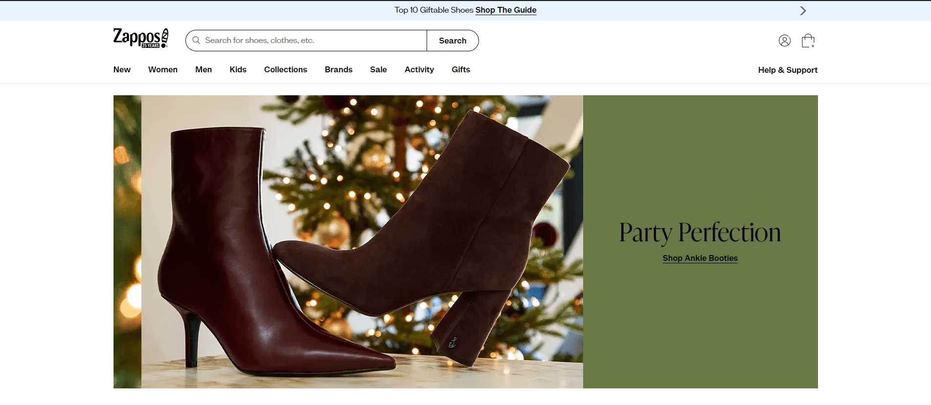
Zappos excels in offering detailed filtering options, enhancing product discovery.
Advanced Filters: Users can filter products by size, color, brand, price, and even customer ratings, narrowing down choices to find exactly what they need.
Clear Subcategory Listings: Within main categories like "Shoes," subcategories such as "Sneakers," "Boots," and "Sandals" are clearly listed, streamlining the browsing process.
Customer Service Links: A prominent "Customer Service" link in the header ensures users can easily access support, building trust and reliability.
4. ASOS: Dynamic and Responsive Design
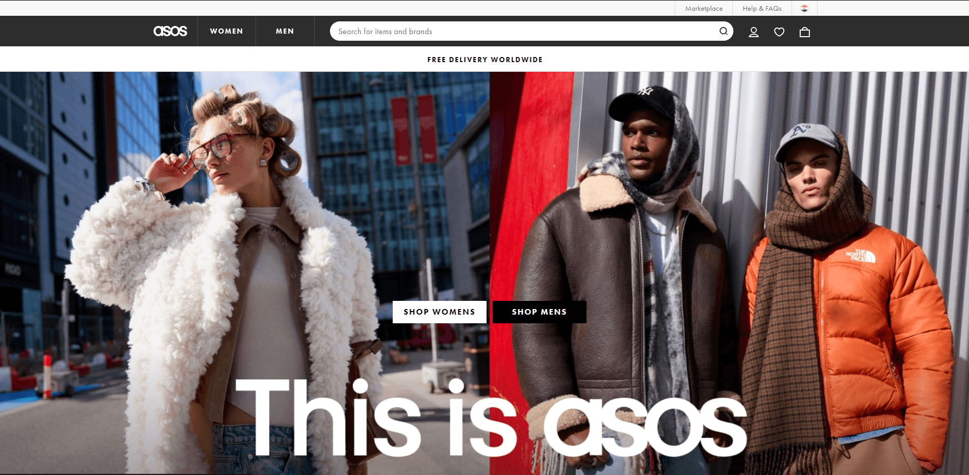
ASOS combines dynamic design with responsive navigation to cater to a diverse audience.
Dynamic Mega Menus: Hovering over main categories like "Women" or "Men" reveals dynamic mega menus with images and links to trending items, new arrivals, and specific clothing types.
Mobile-Friendly Navigation: The mobile version features a collapsible hamburger menu, ensuring a clean interface while providing access to all categories and filters.
Personalized Sections: Sections like "Your Edit" offer personalized product recommendations based on user behavior, enhancing the shopping experience.
5. Apple: Minimalist and Direct Approach
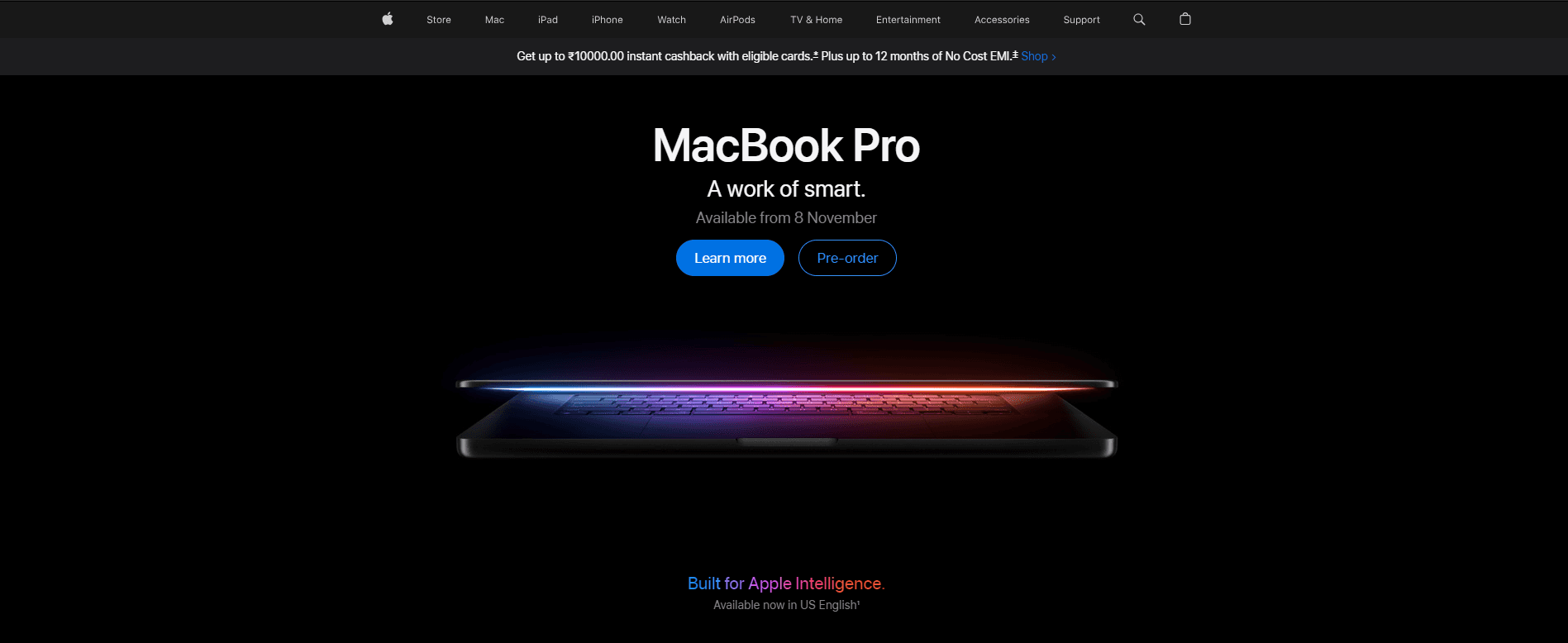
Apple's navigation reflects its minimalist design philosophy, focusing on simplicity and ease of use.
Top Navigation Bar: A clean, top navigation bar lists main product lines like "Mac," "iPad," "iPhone," and "Watch," allowing users to jump directly to their product of interest.
Consistent Layout: Each product page maintains a consistent layout, with sub-navigation links to "Overview," "Tech Specs," and "Buy," ensuring users can find information without confusion.
Support and Search Accessibility: Links to support and a search icon are readily available in the header, providing quick access to assistance and product searches.
These examples demonstrate that effective eCommerce navigation combines clear categorization, user-friendly design, and personalized elements to create a seamless shopping experience. By analyzing and implementing similar strategies, businesses can enhance user engagement and drive conversions.
Effective eCommerce navigation is crucial for guiding users seamlessly through a website, enhancing their shopping experience, and boosting conversion rates. Let's explore real-world examples of brands that have mastered this aspect, breaking down their navigation structures and design choices.
1. Amazon: Comprehensive Mega Menus

Amazon's navigation is a prime example of handling an extensive product range efficiently.
Mega Menu Structure: Hovering over the "All" button reveals a mega menu displaying broad categories like "Electronics," "Books," and "Clothing." Each category expands into subcategories, allowing users to drill down to specific products quickly.
Search Bar Prominence: A centrally placed, prominent search bar with autocomplete suggestions helps users find products directly, catering to those who prefer searching over browsing.
Personalized Recommendations: Based on browsing history, Amazon offers personalized links such as "Inspired by your shopping trends," enhancing user engagement.
2. IKEA: Intuitive Category Navigation

IKEA's website simplifies navigation through clear categorization and visual aids.
Visual Category Links: The homepage features large images representing main categories like "Living Room," "Bedroom," and "Kitchen," making it easy for users to identify and select their area of interest.
Sticky Navigation Bar: As users scroll, the top navigation bar remains fixed, providing constant access to main categories and the search function.
Breadcrumb Navigation: Each product page includes breadcrumb trails, allowing users to trace their path back to previous categories or the homepage effortlessly.
3. Zappos: User-Centric Filtering

Zappos excels in offering detailed filtering options, enhancing product discovery.
Advanced Filters: Users can filter products by size, color, brand, price, and even customer ratings, narrowing down choices to find exactly what they need.
Clear Subcategory Listings: Within main categories like "Shoes," subcategories such as "Sneakers," "Boots," and "Sandals" are clearly listed, streamlining the browsing process.
Customer Service Links: A prominent "Customer Service" link in the header ensures users can easily access support, building trust and reliability.
4. ASOS: Dynamic and Responsive Design

ASOS combines dynamic design with responsive navigation to cater to a diverse audience.
Dynamic Mega Menus: Hovering over main categories like "Women" or "Men" reveals dynamic mega menus with images and links to trending items, new arrivals, and specific clothing types.
Mobile-Friendly Navigation: The mobile version features a collapsible hamburger menu, ensuring a clean interface while providing access to all categories and filters.
Personalized Sections: Sections like "Your Edit" offer personalized product recommendations based on user behavior, enhancing the shopping experience.
5. Apple: Minimalist and Direct Approach

Apple's navigation reflects its minimalist design philosophy, focusing on simplicity and ease of use.
Top Navigation Bar: A clean, top navigation bar lists main product lines like "Mac," "iPad," "iPhone," and "Watch," allowing users to jump directly to their product of interest.
Consistent Layout: Each product page maintains a consistent layout, with sub-navigation links to "Overview," "Tech Specs," and "Buy," ensuring users can find information without confusion.
Support and Search Accessibility: Links to support and a search icon are readily available in the header, providing quick access to assistance and product searches.
These examples demonstrate that effective eCommerce navigation combines clear categorization, user-friendly design, and personalized elements to create a seamless shopping experience. By analyzing and implementing similar strategies, businesses can enhance user engagement and drive conversions.
FAQ's
FAQ's
1. What is eCommerce navigation?
eCommerce navigation is the set of tools and design elements that help users move easily from page to page on an online store. Effective navigation typically includes product categories, filters, and links that allow users to explore and locate products smoothly.
2. What makes good eCommerce navigation?
Good eCommerce navigation prioritizes user experience by using clear labels and straightforward categories that make it easy for users to find what they’re looking for. The design should distinguish navigation elements from page content, ensuring users can intuitively navigate the site.
3. How can I improve my eCommerce navigation?
Here are four tips to enhance your eCommerce navigation:
Implement a sticky top-level navigation that stays visible while users scroll.
Use customer-centered labels that resonate with your audience.
Include a prominent search function for direct product access.
Highlight promotions or sales in the navigation to capture interest.
4. What are the four main types of navigation?
The primary types of navigation in web design include:
Global Navigation: Access to main sections across the site.
Local Navigation: Links within a specific section or category.
Contextual Navigation: Related links within content, guiding users to similar products.
Utility Navigation: Supplementary links like search or account options.
5. What are six essential navigation features for an eCommerce site?
The must-have navigation features include:
Navigation Bar: Centralized access to main categories.
Vertical Menu: Ideal for product-dense categories.
Dropdown Menu: Organizes subcategories neatly.
Sidebar Menus: Provides quick access to filters and secondary links.
Breadcrumb Navigation: Helps users trace their path back to previous pages.
Footer Menus: Offers links to important, non-primary pages like FAQs and policies.
Don't Forget to Share this post:
Recommended Resources
Recommended Resources
Recommended Resources
Recommended Resources
Recommended Resources
Table of content
